We’ve commissioned five new custom fonts–which should be the next default font?
Default fonts are perhaps most notable in the absence of the impression they make. We seldom give them much thought, and therein lies their greatest gift. When a font blends into the background of a user experience, people can jump right into the creative process and stay grounded in their thoughts rather than thinking about the form those thoughts take.
Still, while default fonts may not have the same flair as some of their more eye-catching cousins (we’re looking at you, Bauhaus 93 and Showcard Gothic), they communicate a distinct personality in their own quiet way—a personality that by extension becomes our personality as well. A default font is often the first impression we make; it’s the visual identity we present to other people via our resumes, documents, or emails. And just as people and the world around us age and grow, so too should our modes of expression.
Calibri has been the default font for all things Microsoft since 2007, when it stepped in to replace Times New Roman across Microsoft Office. It has served us all well, but we believe it’s time to evolve. To help us set a new direction, we’ve commissioned five original, custom fonts to eventually replace Calibri as the default. We’re excited to share these brand-new fonts with you today and would love your input. Head over to social and tell us your favorite. And don’t worry if the font you love best isn’t chosen as the next default; all of them will be available in the font menu, alongside Calibri and your other favorite fonts in your Office apps in Microsoft 365 and beyond.
Five new fonts: Meet Tenorite, Bierstadt, Skeena, Seaford, and Grandview #
The degree to which seemingly minute differences in typography can create visceral responses (who can forget the infamous Papyrus sketch on Saturday Night Live?) is a testament to the art and science of font design. The design of an individual letter may be artistic but getting all these individual letters to work together to make words, sentences, and paragraphs is a science of its own. In typeface design, the space and shapes between letters is just as critical as the letter shapes themselves.
The new fonts span the various sans-serif styles—humanist, geometric, swiss-style, and industrial—and we’ve interviewed the designers of each to help bring their nuances and unique personality to life. Read on to learn about their creative inspiration and process.
TENORITE by Erin McLaughlin and Wei Huang #
Tenorite has the overall look of a traditional workhorse sans serif (a font without a serif, or a stroke at the ends, like Times New Roman), but with a warmer, more friendly style. Elements such as large dots, accents, and punctuation make Tenorite comfortable to read at small sizes onscreen, and crisp-looking shapes and wide characters create a generally open feeling.
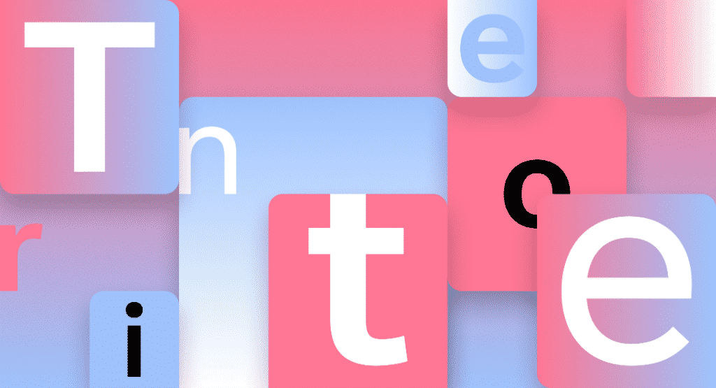
Erin and Wei: After years of Calibri—known for soft corners and narrow proportions—we were craving something very round, wide, and crisp, and the geometric genre felt like the right direction.
We both love the circular forms and sturdiness of Adrian Frutiger’s Avenir. But because customers read and write long paragraphs of text within applications like Microsoft Word, more generous character spacing is helpful. The Tenorite fonts aim to solve this problem.
The display styles of Tenorite, however, are much narrower and inspired by Trade Gothic. This tighter fitting allows for more words to fit on a line, which is great for use in PowerPoint presentations, and in all-caps settings when creating column headings in Excel spreadsheets, for example. The Tenorite Display weights are also a bit thinner and heavier than their Tenorite counterparts, giving the family more versatility.
Tenorite’s punctuation was particularly fun to create, and we didn’t shy away from going large and circular. In many typefaces, the punctuation is too faint, tightly spaced, or easily confusable for on-screen rendering, where clarity is key.
BIERSTADT by Steve Matteson #
Bierstadt is a precise, contemporary sans serif typeface inspired by mid-20th-century Swiss typography. A versatile typeface that expresses simplicity and rationality in a highly readable form, Bierstadt is also notably clear-cut with stroke endings that emphasize order and restraint.

Steve: Microsoft had requested a new typeface in the “grotesque sans serif” genre, a style defined by block-style letters without calligraphic flourish or contrast between thick and thin strokes. Helvetica, created by Switzerland’s Haas Type Foundry in 1957, is the most famed example.
Swiss typographers gravitated to grotesque designs like Helvetica because of their suitability for grid-based typography. In today’s world, I believe a grotesque typeface’s voice needs a bit of a human touch to feel more approachable and less institutional. Bierstadt’s systematic design contains organic touches to help humanize digital environments and soften the regimented order of grid typography.
Microsoft already has Arial—which has many attributes from grotesque types preceding Helvetica—and my approach was to design a sans serif which would contrast with Arial by being far more mechanical and rationalized. The terminal endings are precisely sheared at 90 degrees—a modern note contrasting the softer, angled endings in Arial—and a lack of somewhat fussy curves found in Arial’s ‘a’, ‘f’, ‘y’ and ‘r’.
As for the name, Bierstadt is named for one of Colorado’s 14,000 ft peaks. When I think of Swiss type, I think of the Alps, and since I’m based in Boulder, my Alps are the Rockies.
SKEENA by John Hudson and Paul Hanslow #
Skeena is a “humanist” sans serif based on the shapes of traditional serif text typefaces. Its strokes are modulated, with a noticeable contrast between thick and thin and a distinctive slice applied to the ends of many of the strokes. Skeena is ideal for body text in long documents, as well as in shorter passages often found in presentations, brochures, tables, and reports.
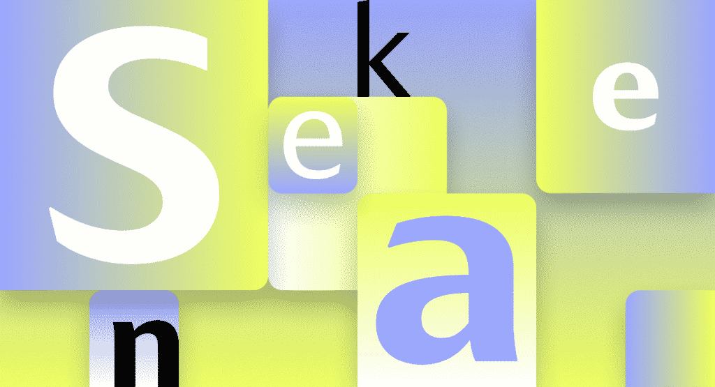
John: Skeena is a fresh take on sans serif, a genre that has been dominated in the past decade by neo-grotesques and geometrics. We wanted to create a humanist sans serif with generous proportions and a higher than usual stroke contrast (also known as the variation in weight between thick and thin parts of the letter). Paul introduced diagonally sheared terminals to enhance Skeena’s distinctiveness, and I added the curving of entry and exit strokes in letters like ‘n’ and ‘a.’
Because Microsoft wanted us to design for both text and display fonts, I decided we should use the latter to push the stroke contrast further. The display fonts, used at larger sizes, while clearly related to the text fonts, have a more dramatic impact.
Paul: I find a typeface begins as either a mental picture that takes a visual form or an abstract idea that is given life by constantly assessing its forms against the abstract idea. Skeena began in my mind as the latter and fleshing it out required continual assessment to ensure my original idea was being reflected in the typeface’s forms.
Because the ask for a humanist sans was fairly open, I wanted to cherry-pick from multiple typographic periods and force them to work together. I chose elements that I found challenging to appreciate aesthetically; for example, I like high contrast san serifs. These can be unsightly and too brittle to work effectively at small sizes in digital environments, which is why they tend to be associated with luxury branding and opulence.
I’m proud that Skeena respectfully nods towards type-forms of the 20th Century while adding a touch of unfamiliarity. It’s a contemporary typeface that gently subverts expectations without polarizing the wonderful humanist san serifs that came before it.
SEAFORD by Tobias Frere-Jones, Nina Stössinger, and Fred Shallcrass #
Seaford is a sans serif typeface that is rooted in the design of old-style serif text typefaces and evokes their comfortable familiarity. Its gently organic and asymmetric forms help reading by emphasizing the differences between letters, thus creating more recognizable word shapes.
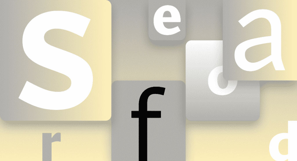
Tobias: At the start there was just a broad description of a personality—comfortable, warm, inviting, animated—so we began by studying the overall movement of old-style serifed faces. We hoped to create the same, familiar kind of warmth, but without the serifs.
We didn’t want to be too literal about these references, but many of their themes loosely guided our work, such as a preference for differentiation of shapes over repetition and symmetry. And since most of the running text is set in lowercase, the earliest drafts focused on the lowercase branches, bowls, and terminals, tracking how those elements would relate across the various styles.
Nina: To pinpoint the kind of familiarity and “comfort” the typeface should evoke, we also looked at pictures of old armchairs: in chair terms, we were going for a practical interpretation of a beautiful family heirloom; durable upholstery, nothing overtly plushy or nostalgic. And when it comes to italics, it turns out there are parallels between chair ergonomics and typography: rather than inflating it and making it softer, trust the rigid moments that are good for your back.
GRANDVIEW by Aaron Bell #
Grandview is a sans serif typeface derived from classic German road and railway signage, which was designed to be legible at a distance and under poor conditions. Grandview is designed for use in body text but retains the same qualities of high legibility, with subtle adjustments made for long-form reading.

Aaron: When I was first asked to create a font that retained the spirit and personality of the German Industrial Standard (DIN) and was more readable for body text, I wasn’t sure it was possible.
Typefaces for body text need to encourage the eye horizontally across longer lines of text, but DIN was intended for high legibility in short runs of text in medium to narrow spaces. So, I was concerned that by trying to force the Grandview design to become more text-centric, it would no longer retain the same feeling.
Using Bahnschrift—a prototype I developed in the mechanical style of DIN—as a starting point, I decided to keep the x-height large. This results in better legibility and readability at smaller sizes on low-resolution devices, which matters because Grandview is intended for body text on any computer running Windows. Then, I created a version about 20 percent wider than the original design and interpolated between them to find the exact right balance between Bahnschrift-ness and the horizontal aspect. Ultimately, I found increasing the width of the lowercase by 40 units (four to five percent) was perfect. The width of the uppercase was also increased by about 20 units (roughly two percent) to keep them in step with the lowercase.
The resulting design, Grandview, preserves the voice oftheoriginal and works exceptionally well for long-form text settings. I’m excited to see how the community engages with it, particularly because the mechanical style of DIN is popular across a wide range of design implementations, from data visibility and gaming to document settings. I can’t wait!
What’s next? #
We’ll be evaluating these five directions over the next few months, but we won’t be doing that alone. All five families are now available via the cloud across your favorite Microsoft 365 apps and experiences. Go use the fonts starting today, and show us which you love best with feedback and comments on social.


